Elements Styles
Each element inside the Page Builder can be styled from the Styles tab. The styling options are grouped in categories. Some options may be available or unavailable depending on the element type.
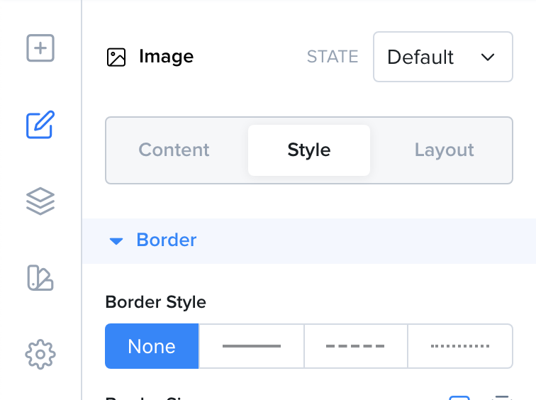
Styling elements on the Styles tab
You can use the search field at the top of the tab to find a style quickly. You can also press CMD or CTRL + K to search styles.
When you are editing a tablet or mobile view, the styles you change only affect the current device and smaller devices. Learn more under Responsiveness.
Common Styles
Section titled “Common Styles”Here is a list of the most common styles that you will find under the Styles tab and a description of how they work.
| Style | Description |
|---|---|
| Border Style | The border can have different styles, solid, dashed or dotted. You can also remove the border by selecting None. |
| Border Size | The border size defines how thick the border is. |
| Border Radius | The border radius defines the corner roundness. |
| Border Color | The color of the border. |
| Shadow | Adds a shadow to your element. The shadow can be outside the element or inside. You can also change the shadow’s color, horizontal and vertical offsets as well as its blur and spread. |
| Width | The width of the element. Found in the Sizes group. |
| Height | The height of the element. Found in the Sizes group. |
| Min Width | The minimum width of the element. |
| Min Height | The minumum height of the element. |
| Max Width | The maximum width of the element. |
| Max Height | The maximum height of the element. |
| Background | The background of the element. It can be a color, a gradient or an image. |
| Opacity | The opacity of the element from 0 to 100%. Found in the Look group. |
| Visible on | On which devices the element should be visible. Found in the Look group. |
| Overflow | The behavior a container element should have when its children take up a larger size. Visible will show the overflowing children. Hidden will hide the overflowing children. Scroll will add a scrollbar to the parent. Found in the Look group. |
| Cursor | The mouse cursor icon to show when the element is hovered on desktop. Found in the Look group. |
| Animations | The entrance animation for this element. |
More Style Groups
Section titled “More Style Groups”| Group | Description |
|---|---|
| Spacing | The margin and padding around the element. |
| Typography | The font, size, weight, color and other text options. |
| Layout | How the element places its children, for example with flex or grid. |
| Alignment | How the element is aligned. |
| Direction | The text direction, left to right or right to left. |
| Flex Item | How the element behaves inside a flex parent, for example grow, shrink and order. |
| Grid Item | Where the element sits inside a grid parent. |
| Position | The element position (for example relative, absolute, fixed or sticky), its offsets and its z-index. |
| State transition | How smoothly style changes happen, for example on hover. |
| CSS Filters | Effects such as blur, brightness, contrast, grayscale and more. |
| Transform | Rotate, scale, skew or move the element. |
| Backdrop Filter | Effects applied to what is behind the element, such as a frosted glass blur. |
| Blend Mode | How the element blends with what is behind it. |
| Aspect Ratio | Keeps the element at a fixed width to height ratio. |
| Clip Path | Cuts the element into a shape such as a triangle, star or hexagon. |
| Text Control | How text wraps, breaks or gets cut off. |
| Object Fit | How an image or video fills its box. Only for images and videos. |
| Background Video | A video that plays behind the section content. Only for sections. |
| Divider | A shape divider, such as a wave, at the edge of the section. Only for sections. |