Page Structure and Layouts
Understanding how the page layout works will allow you to easily create any type of page design you can imagine. At anytime, if you want to have a clear view of your page structure, click the Layers icon on the left sidebar to bring up the Layers panel.
Page Body
Section titled “Page Body”The first element in your page is the Body. This is the root element and it cannot be deleted. Every other element in your page will be underneath the Body element.
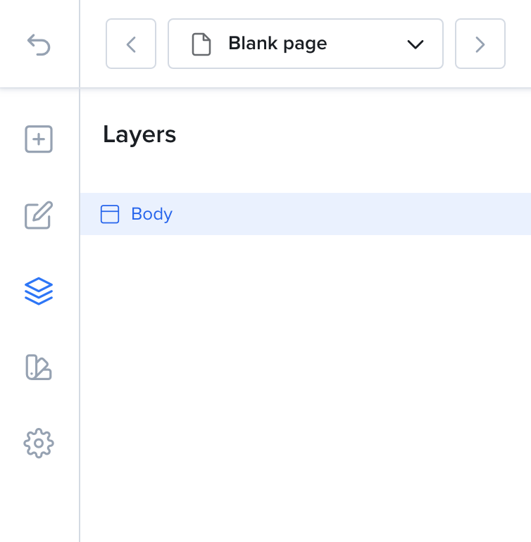
The Body is the root element in your page
Before you start dropping elements inside of the Body, you need a section. The easiest way to start is to add a layout.
Sections
Section titled “Sections”A Section defines a part of your page. Typically, each large block in your page will be a different section. You can have a section for your product, a section for your features, another one for the footer and so on.
When you drop a layout directly on the page, the builder wraps it in a new Section for you. You can also add ready-made sections from Saved sections in the Add sidebar. Learn more on Smart Sections.
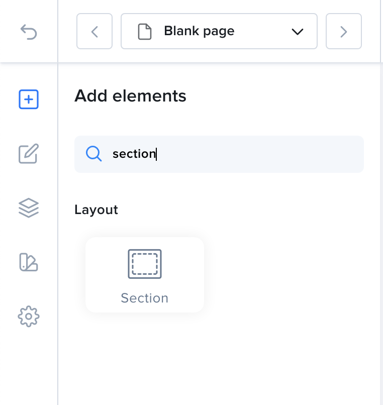
Adding a section to the content area.
Layouts, Rows & Columns
Section titled “Layouts, Rows & Columns”If you are looking to create a responsive layout, you need a structured layout that is able to change depending on the size of the device your page is displayed on. That’s where layouts come into play.
Click the + icon on the left sidebar to open the Add sidebar. Under Basic elements, open Layouts. You can choose from these presets:
- Single column
- Two columns
- Three columns
- Four columns
- Single row
- Two rows
Drag a layout and drop it onto the page. For example, if you drop Two columns, the Layers panel will show a structure like this:
Body|- Section| |- Row| | |- Column| | |- Column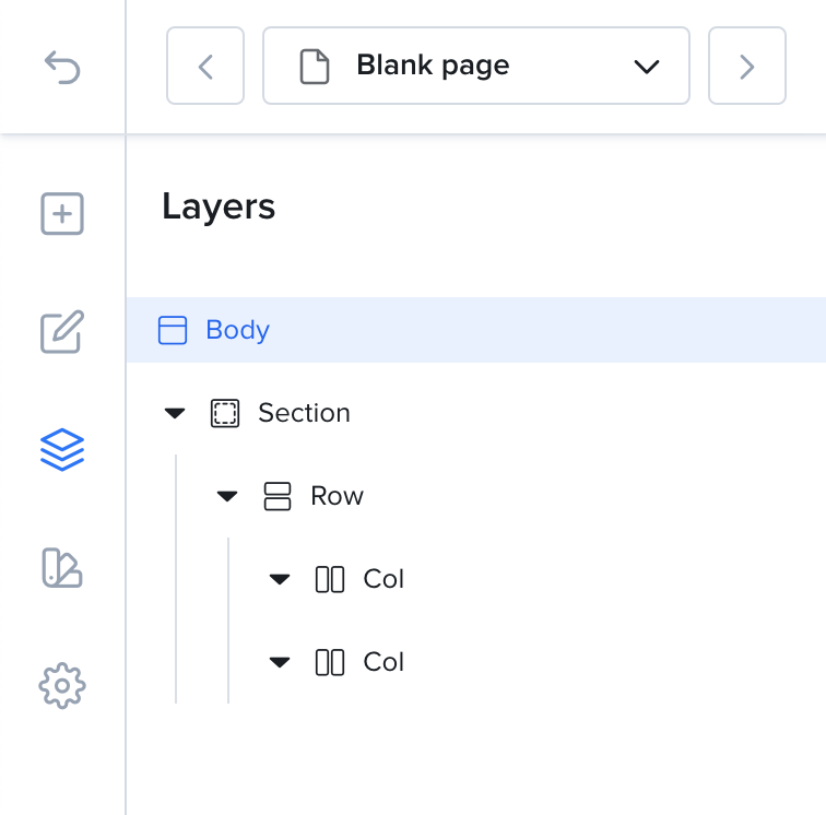
Columns Layout
Boxed Layout vs Full Width
Section titled “Boxed Layout vs Full Width”Each section content can either take up the full width of the page or have a fixed width at the center of the page.
To change it, select your section and open the Settings tab. In the Layout group, choose a Type:
- Wide - Stretches content to fill the entire width of the section.
- Boxed - The content is confined to a fixed width.
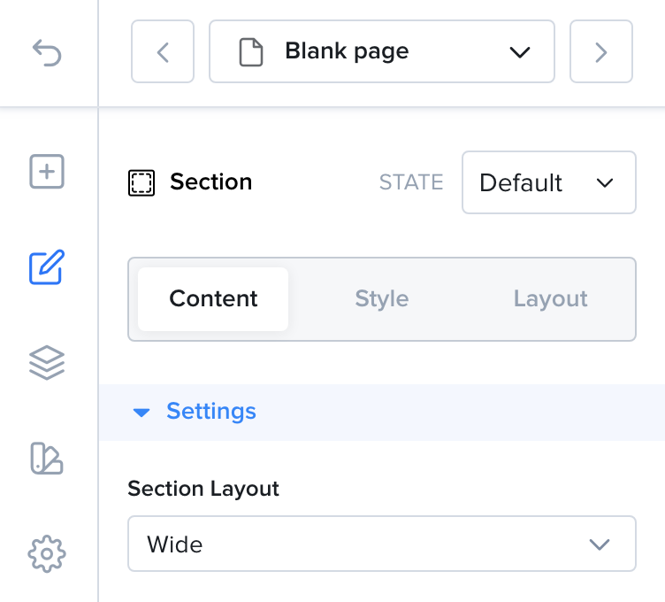
If you choose Boxed, you can set the width right below it. This width applies to all sections of your page.
Container Layout
Section titled “Container Layout”The Container element is a wrapper that can hold several children.
In this example, we have a Container with two Images inside.
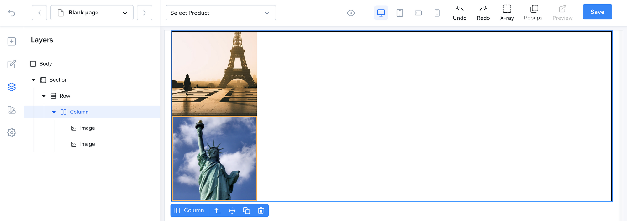
Container with two Images inside
Let’s say we want the two images to be horizontally aligned at the center of the container.
- Select the Container then go to its
Stylestab. - In the
Layoutgroup, choose the flex layout and the horizontal direction - Select the center horizontally icon.
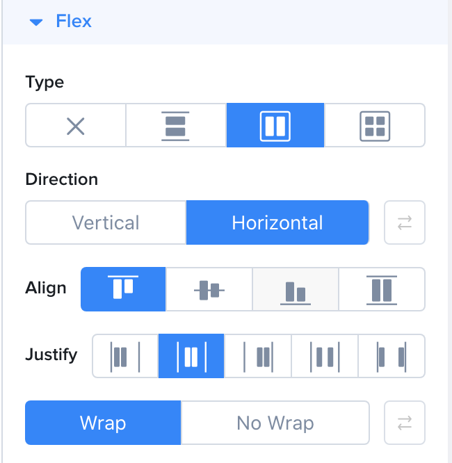
Flex centered horizontally
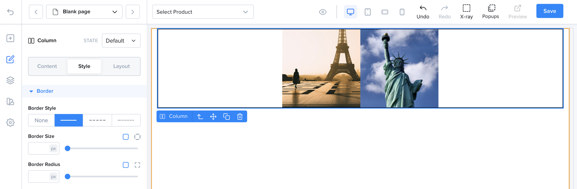
The two Images are now aligned horizontally at the center of their parent Container.
As you can see the Flex layout has a large set of options. Feel free to play around with the settings to achieve the result that you want.