Text Elements
| Element |
Description |
 |
A block of text that can serve mainly as a paragraph. The text can be edited from the sidebar or by directly inside the content area by double clicking it. |
 |
A block of text that can serve as a headline, subheadline or title. |
 |
A list wrapper. |
 |
A list item that goes inside the list. |
| Element |
Description |
 |
An image element to display images for your products and offers. Images can be uploaded from your desktop or hotlinked from a URL. |
 |
A video element to embed videos from YouTube or Vimeo |
| Element |
Description |
 |
A form input to collect information from your visistors |
 |
A checkbox input for your forms |
 |
A button that can serve to link to other pages, external website or to submit a form |
 |
A text link to create a link to another page or to an external website |
 |
A dropdown list that lets the visitor select one of the items in the list |
 |
A text area to let the visitor enter a large text |
 |
A stars selector, typically used when writing a product review. |
 |
A label that goes next to a form element to give the visitor guidance about the what information should be input in a field. |
 |
The File input is used to upload a file. You can use it to collect images for reviews or collect files from your buyers at checkout. |
 |
The review form lets your visitors upload reviews for your product. This element should be used on a product page. |
Layout Elements
| Element |
Description |
 |
A page section that holds a porition of the page. |
 |
A container is a block that can be used to wrap several elements. |
 |
A spacer is an element that is used to add space between sibling elements. |
 |
A divider is used to add a line between elements. |
 |
A row is used to hold several columns to make a responsive layout. Each row can hold up to 12 column width. |
 |
Columns go inside of rows. Each column has its own width size. |
 |
Masonry is a grid layout based on columns. Unlike other grid layouts, it doesn't have fixed height rows. A great example of the masonery layout is the layout on the Pinterest website. |
Miscellaneous
| Element |
Description |
 |
The countdown timer is used to add scarcity to your offers. It can be an evergreen countdown timer or a countdown timer towards a defined date. The timer comes in different styles. |
 |
The Images element is used to show your product images in an easy to navigate gallery. |
 |
The Toggle element is used to show and hide a block of information. When using the Toggle element, the sidebar Layers panel becomes very handy as it always shows all the items even when they are hidden in the content area. |
 |
The Currency Converter lets your visitors see the prices in their local currency or in any currency that they choose |
 |
Similar to the Stars Selector, the Stars element is a static version where you can choose how many stars you want to show |
 |
The Sticky element is a container that stays fixed on the screen while the user is scrolling your website. |
 |
The carousel (or slider), is an effective way of displaying multiple images or content in a single space. It not only helps in saving screen space, but also encourages visitors to focus on important content and improves the overall visual appeal effectively. |
 |
Tabs are used to group information under tabs. When clicked, each tab will toggle its content and hide other tabs' contents. |
 |
An Accordion menu is a vertically stacked list of headers that can be clicked to reveal or hide content associated with them. It is one of many ways you can expose content to users in a progressive manner. |
 |
Popups can be managed from the Popups menu in the top bar. You can also add a popup from the sidebar using the Popup element. The Popup will them show up inside the menu on the top bar. |
Checkout Elements
All the following elements should be used for the checkout process with the exception of the Order Summary that goes in the Thank You page.
| Element |
Description |
 |
The payment form allows the buyer to choose the payment method that they want to use inside the checkout. |
 |
Use the Express Checkout element allow buyers to pay using an express checkout method such as PayPal Express Checkout. |
 |
The Order Bump element displays the Order Bump for the product that is being sold. |
 |
The shipping address of the buyer. |
 |
The billing address of the buyer. |
 |
The checkout summary widget that shows the summary of the order along with a discount field. |
 |
The order summary widget that shows the summary of the order in the thank you page. |
| Element |
Description |
 |
The Variant Selector is used inside the Product Page and allows the buyer to choose the product variant that they want to buy. |
 |
The Custom HTML widget allows you to add custom HTML code in different places of the page. Keep in mind that you can also use the Page Settings to add your own custom HTML without needing to use this widget. |
Data
| Element |
Description |
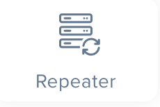 |
The Repeater to repeat your a part of your design in order to show a list information. For example, you can use a repeater to show a list of reviews. We go over the Repeater in more detail on the data binding page |