Each element inside the Page Builder can be styled from the sidebar under the Style tab. The styling options are grouped in categories. Some options may be available or unavailable depending on the element type.
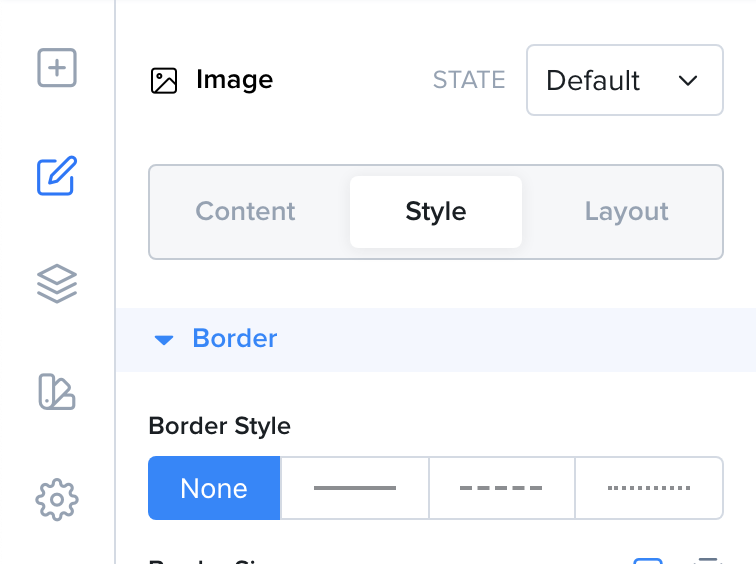
Here is a list of the most common styles that you will find under the Style tab and a description of how they work.
| Style | Description |
|---|---|
| Border Style | The border can have different styles, solid, dashed or dotted. You can also remove the border by selecting None. |
| Border Size | The border size defines how thick the border is. |
| Border Radius | The border radius defines the corner roundness. |
| Border Color | The color of the border. |
| Shadow | Adds a shadow to your element. The shadow can be outside the element or inside. You can also change the shadow's color, horizontal and vertical offsets as well as its blur and spread. |
| Width | The width of the element. |
| Height | The height of the element. |
| Min Width | The minimum width of the element. |
| Min Height | The minumum height of the element. |
| Max Width | The maximum width of the element. |
| Max Height | The maximum height of the element. |
| Background | The background of the element. It can be a color, a gradient or an image. |
| Opacity | The opacity of the element from 0 to 100%. |
| Visible On | On which devices the element should be visible. |
| Overflow | The behavior a container element should have when its children take up a larger size. Visible will show the overflowing children. Hidden will hide the overflowing children. Scroll will add a scrollbar to the parent. |
| Cursor | The mouse cursor icon to show when the element is hovered on desktop. |
| Animation | The entrance animation for this element. |