With over 60% of visitors coming from mobile devices, your pages should be 100% mobile friendly.
LightFunnels was built from the ground up with the mobile experience in mind. Not only you can easily build mobile responsive designs, but also, your pages are optimized to load fast, even on slow mobile data networks.
To create a responsive layout, we recommend you use the Rows and Columns layout that we covered on the Page Structure and Layouts page.
TLDR.
In order to create a mobile responsive design:
- Create your design on desktop
- Switch to tablet and make the changes you only want for tablets
- Switch to mobile and make the design changes you only want on mobile
Once done you will see that your design looks the way you want it on all devices.
Make a Desktop Design Mobile Friendly
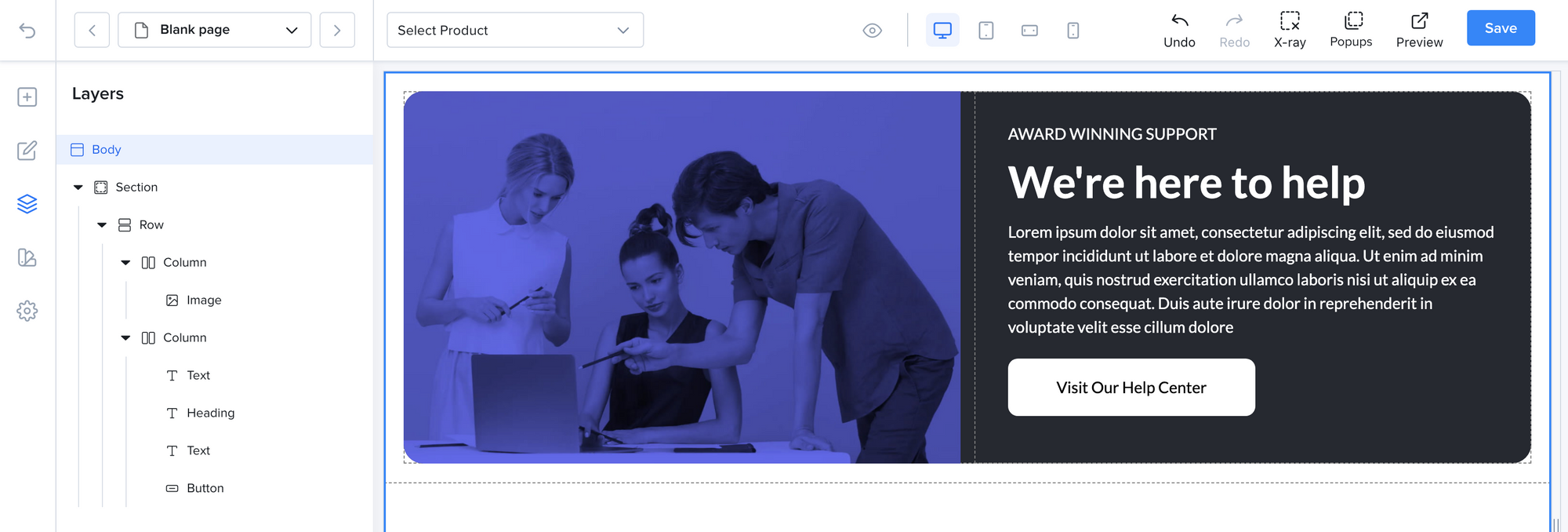
Let's take a section that has two columns of 6 width each.

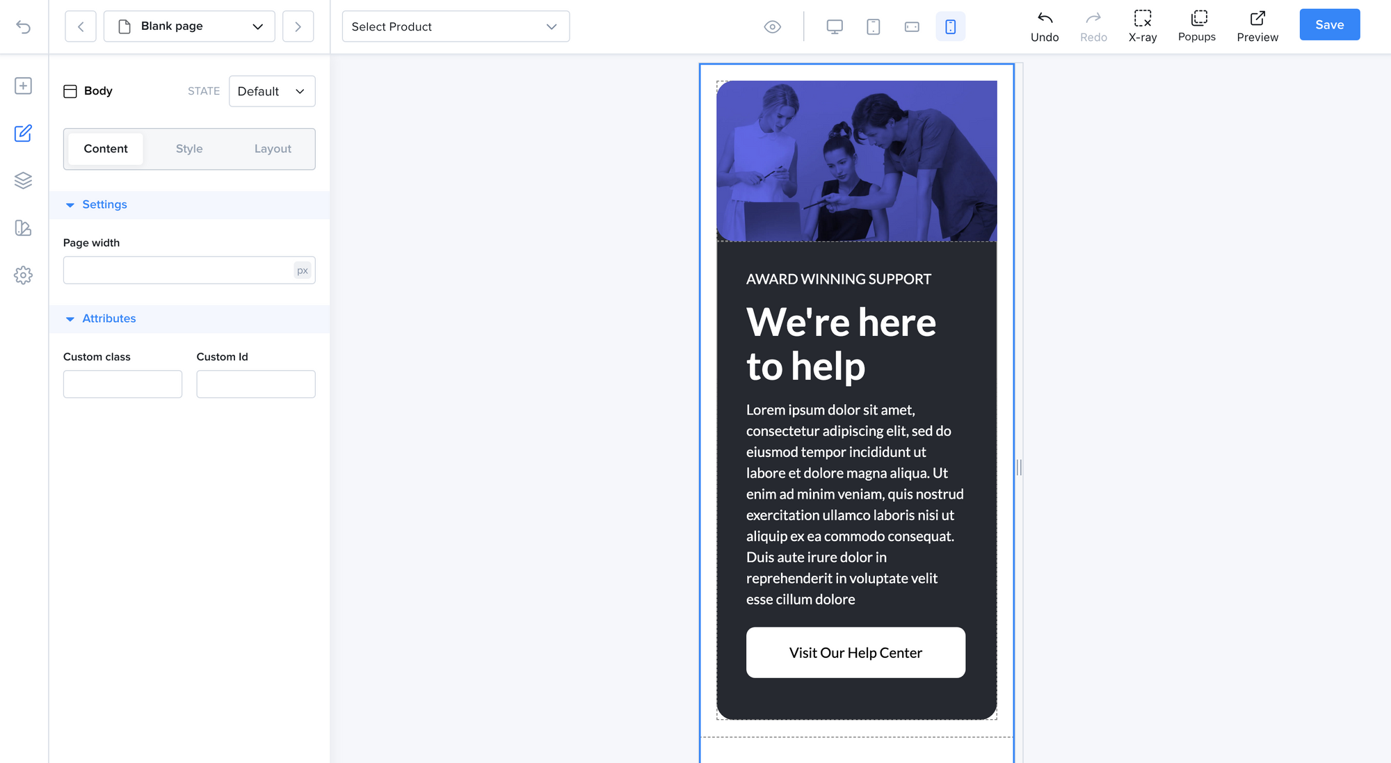
This layout was built for desktop devices. Let's preview it on mobile.

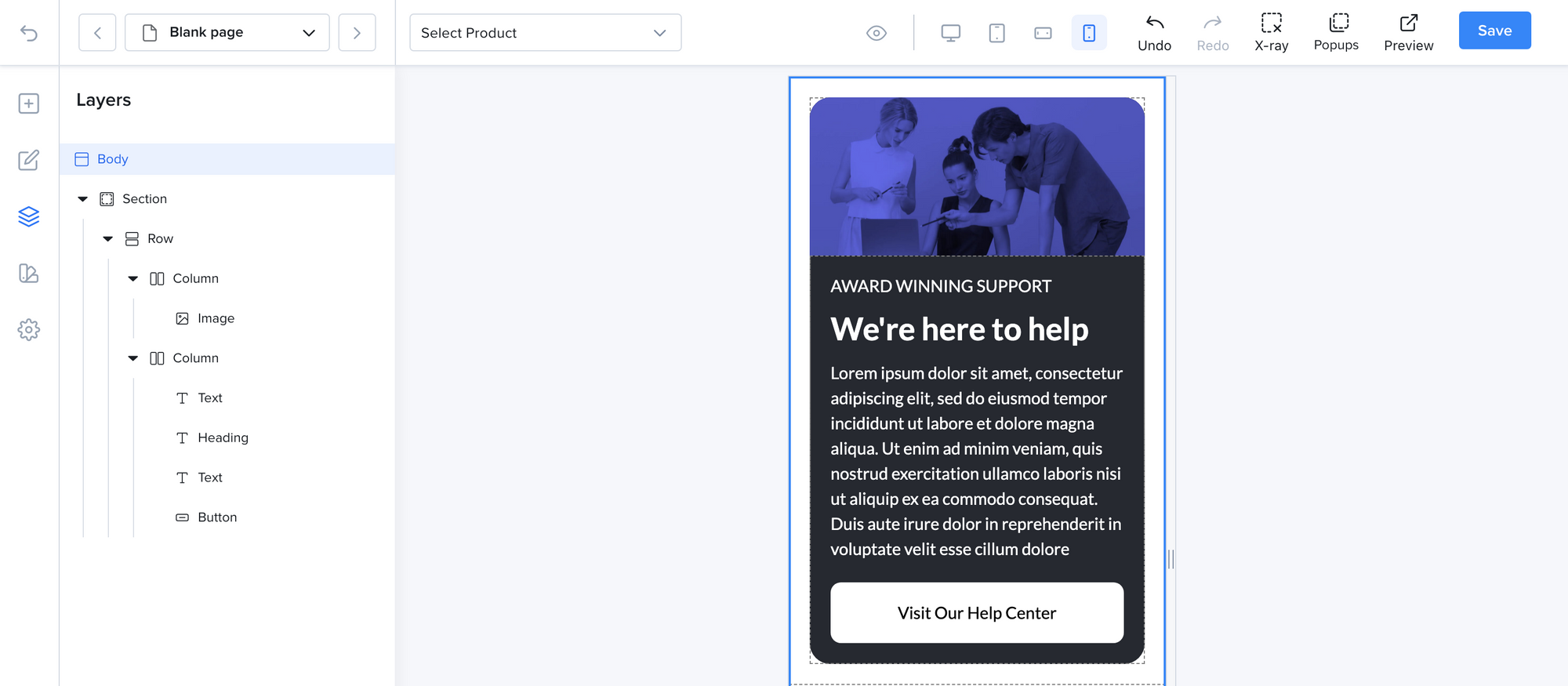
The layout already looks decent on mobile but we can still add some adjustments to it. We will do the following adjustments.
- Fix the border radius around the image
- Reduce the headline text size
- Reduce the image size
- Reduce the padding around the text.

Now the section is easily readable on mobile.
You can also hide / show elements on different device sizes using the visibility option on each element.
This will hide an element on mobile landscape and portrait modes.

Going back to desktop, we can see that our layout did not change. The page is now optimized for both mobile and desktop.
